In an increasingly crowded market and surrounded by competitors with voices much than theirs, Kingston University knew they were sitting on a wealth of student stories, successes and innovations. With a brand that wasn’t only ill-equipped to shout about it, but one that was actively doing a disservice to the quality of output that the University was producing, they were in search of a step-change in how they presented themselves to the world.
It was clear that Kingston University needed a brand system that could flex with its ever-changing content while standing firm in its identity. For this, we looked to an unlikely source of inspiration: television. Just as TV channels curate a rich mix of programming within a consistent broadcast identity, we developed a visual and verbal framework built on clarity, consistency and creative freedom.
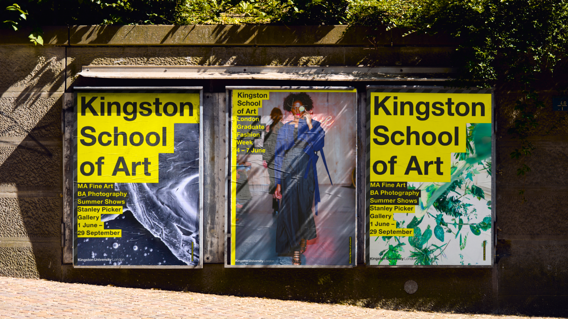
The result was a fully refreshed brand that balances structure with expression and excellence with attitude. A robust typographic approach designed to handle everything from research announcements to student campaigns, and a messaging system that puts process and output front-and-centre, paved they way for a brand system which eight years on, is still going strong.
Extending this thinking across tone of voice, environmental graphics and signage, created a joined-up brand approach that could show up coherently on screen, in print and in physical spaces – testament to the power of designing for longevity, not just launch.